Here is my latest work for Happinez Magazine, featured in their Zomer (Summer) edition, just out now. The assignment was to create 8 photographs of sacred geometry, with a handmade, organic and natural touch. It was actually very challenging, but so much fun. Researching the meaning behind each symbol was interesting, and coming up with unique ways to show these symbols had my mind in a twist. I went with the flow of the twist, and it all eventually unravelled, creating these photographs over about 4 days in the studio...
The idea was to start with the simple shapes like square, circle and triangle, and then progressing to the more complex symbols like the dodecahedron, octahedron, tetrahedron, icosahedron. Everything from this shoot I made from materials I had already in my home (like the collection of marbles from my childhood) and studio, as well as fallen flowers and branches from the neighbourhood...
These perspex cubes were part of my old stylist's kit - I'd had them made about ten years ago. I love the play of nature with them here, the soil and roots and sand make the shot.
This gorgeous Japanese handmade dodecahedron was given to Laly by my dear friend Kylie on one of her trips to Japan a few years ago. When I have a commissioned shoot like this, I walk through my house looking for inspiration, and when I saw this on Laly's shelf I knew it had to be in this shoot, and it made me smile to know that it was given by Kylie, so special. The bougainvillea grows in abundance at the entrance of my studio building, and combined with this fabric from Major & Tom, this became my favourite photograph of the collection.
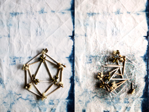
And then came the biggest challenge of all: the mother of all symbols, the icosahedron. This was the only symbol I didn't have a plan for, and left it completely up to my intuition to figure it out. Which was apt - the icosahedron symbolises water, which is as we know all about movement, flow and change. It's also connected to emotions, and can be used to enhance the creative process. The process for creating this was beautiful - I played with different materials, and then before I knew it I was being guided to paint some bamboo skewer sticks with streaks of white, then I cut them into sets of equal lengths and laid them ever so carefully onto this stunning backdrop - a lightly waxed indigo dyed piece of fabric given to me as a gift from one of my mentor clients, Bernadette. I love that these beautiful handmade gifts that I've lovingly received over the years have become a part of my work, it shows the power of the collective and how we can enrich each other's creativity (remember this little velvet box?). Through this process, I didn't know what the outcome was going to be - I didn't see the end result and then work toward it, instead I allow each step to happen with absolutely no knowledge of what is about to transpire. I understand some people become frozen with fear if they don't have a concrete plan for everything, but I get excited. To me it shows there is so much room for possibility, and my intuition is free to play. I placed eucalyptus buds at each point. The second shot here I just love - I messed up the pieces to show the transience, which for me is just as beautiful - to create beauty, and then let it go.
I made some video footage of the behind the scenes which I'll put together and share on my Patreon page for those who are interested in the behind the scenes.
xx


